Page 1 of 12
Suzumiya Haruhi Pictures!
Posted: Tue Oct 10, 2006 12:05 pm
by Guest lol
Here's a 1280/1024 Wallpaper I made, it's not that bad...
Post Pictures in this thread!
Hall of Fame
Large Pics and others *56k beware*
Gifs
mod edit: spoilered the bigger pics to make the thread easier to navigate.
Posted: Thu Oct 12, 2006 5:43 am
by Mr.Pringles
woo pretty wallpapers... I like the second one more, I have too much stuff at my desktop to take a good shot at the first one

Posted: Thu Oct 12, 2006 6:31 am
by Guest lol
hehe yeah, I use the orange Yuki background too.. yuki ftw!
Posted: Thu Oct 12, 2006 7:47 pm
by Guest lol
Also, new haruism banner size!
If you want any photoshop jobs or anything send me a private message. I can make a forum banner for you even though I'm not the best at photoshop
Posted: Thu Oct 12, 2006 11:14 pm
by XkaOnslaught
the banner is too long, shorten it

oh and you should make the animatiaon on the 1st avvie slower, currently i think its too fast, and the last one was the best of the bunch

Posted: Fri Oct 13, 2006 9:39 pm
by Guest lol
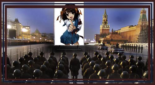
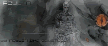
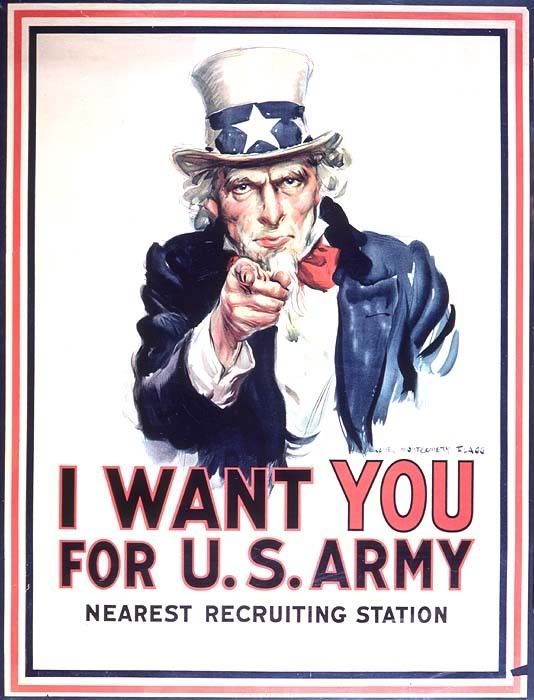
Just completed a new one!
First look at this
Now look at this
After I finished making the haruhi wants you I had a serious deja vu moment : \ Have I seen it before o_O...
Posted: Sat Oct 14, 2006 7:29 pm
by XkaOnslaught
nice! SOS Brigade would sound nicer though.
Posted: Sun Oct 15, 2006 4:53 pm
by onizuka-gto
wow. you did some great pictures there, guest LOL.
especially the recruitment one.
*saves it for an alternative wallpaper*
edit: oooh. i like that avatar too. cheers Guest.

edit2: hmmm...banner?...mm...

Posted: Mon Oct 16, 2006 6:42 am
by Guest lol
Omg woot I got stickied!
Posted: Tue Oct 17, 2006 6:21 pm
by Guest lol
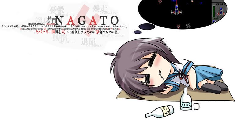
Seeing as how people like the Nagato Yuki background I made banner.
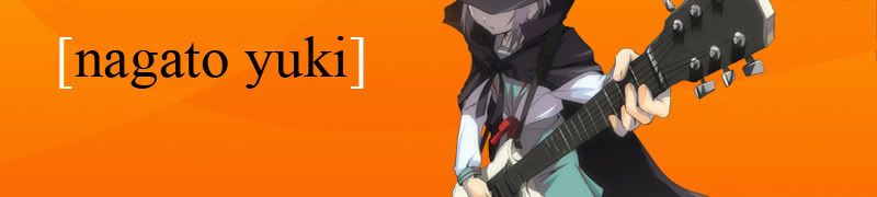
Something just doesn't feel right about this image though. Is it too plain? Is Yuki lacking legs? I just dont know what, but I feel that this isn't one of my better photoshopped images.... maybe it needs a border.

Added a border, shrank Yuki's size, still doesn't feel right..
Anybody want to evaluate and give me a suggestion, or some constructive criticism?
Posted: Tue Oct 17, 2006 8:00 pm
by Haiyami
Posted: Tue Oct 17, 2006 10:44 pm
by bicube
Guest lol, try putting in the Japanese text like in the wallpaper. It also looks like it's missing something to me, and I think that it's because there's too much empty space. Either that, or there's too much contrast between Yuki and the orange. Anyways, just a couple things my eyes don't find comfort in.
Posted: Thu Oct 19, 2006 8:28 pm
by Guest lol
In the end I decided to scrap that crappy orange version altogether, I just dislike it.
I followed the suggestions you guys posted and filled in the crappy black spaces with maple leaves... I wanted to have cherry blossem leaves, but I'm lazy, I might make a cherry blossem leave brush later when I feel like it... I also decided I would do what I did to fill the blanks in onizuka's banner, put in a big ass picture of yuki in the back lol.
Version 1
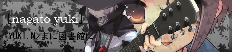
Version 2
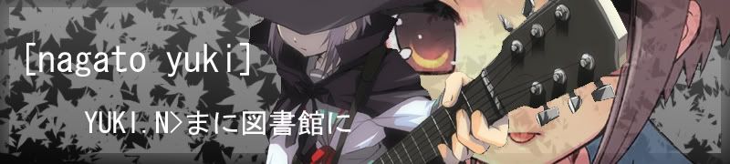
Personally, I think version 1 is better because the text's colour isn't exactly the same.
Anybody want to criticize and say which one is better and why etc etc etc.
Posted: Thu Oct 19, 2006 9:08 pm
by bicube
Very very nice. It's infinitely better than the orange one. I also prefer the first version, mostly because the bottom text is black and doesn't seem so invading, especially when it reaches Yuki.
Posted: Fri Oct 20, 2006 1:42 am
by XkaOnslaught
Nagato's background needs dull colors, and not bright ones. color clash is the problem