
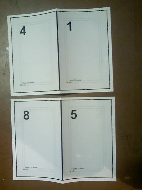
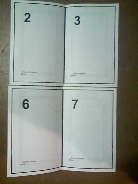
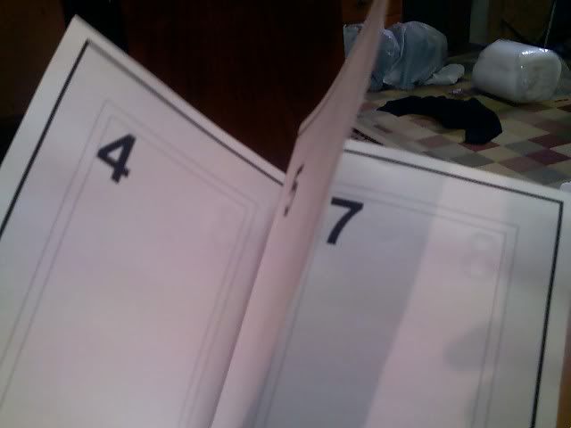
Hey there everyone, I just started a neat little project, perfect binding volume 1 into a 5.5 x 8.5 paperback and I and I thought that you might find it interesting. The guide that I used is here. I have printed off volume 1 using a modified version of molitar's wonderful pdf with the pages rearranged so that they will print properly on letter sized paper folded in half (page order is -- [4][1] -- [2][3] -- for the first and second sides, respectively).
I wanted to know if anyone else had tried binding any of the books, and if so, how it turned out. If anyone would like the rearranged pdf, or a version with the pages in a different order, let me know and I will be glad to upload it somewhere.
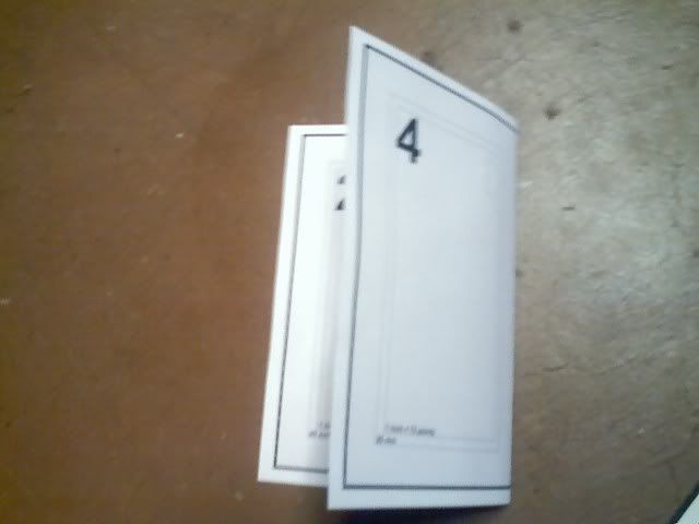
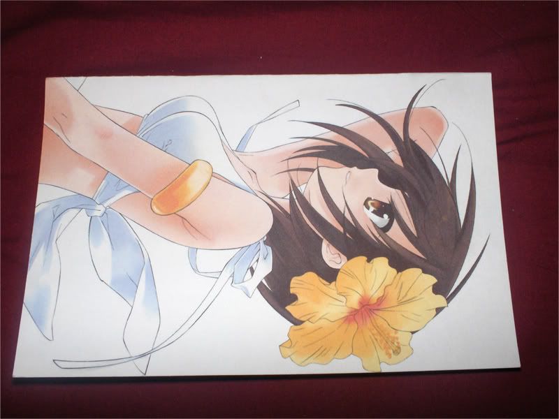
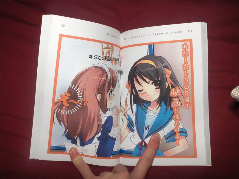
here are my photos, I hope this might inspire more people to try this, it is really fun
spoilered for size
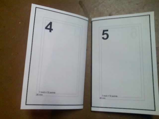
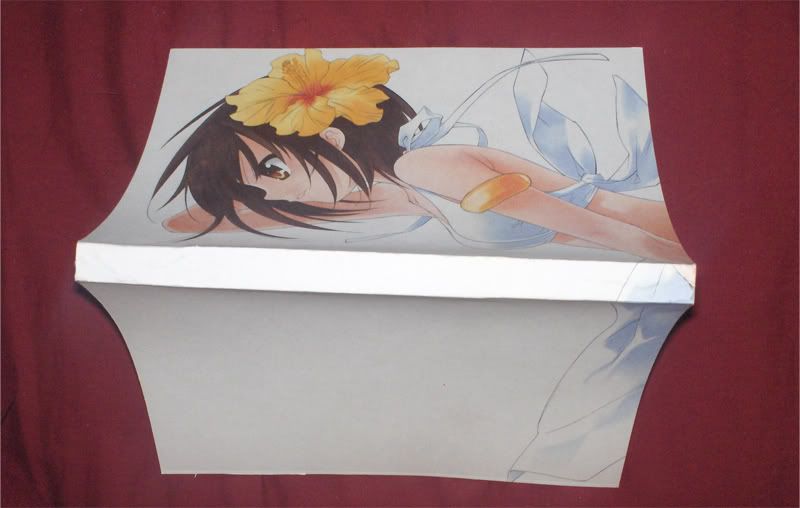
pics of how the book was printed
Spoiler! :
Spoiler! :

Spoiler! :


Spoiler! :
Vol 1
Vol 2
Vol 3
Vol 1 imposed
Vol 2 imposed
Vol 3 imposed
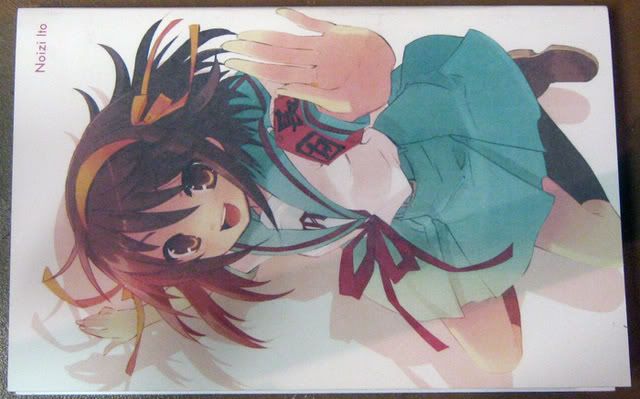
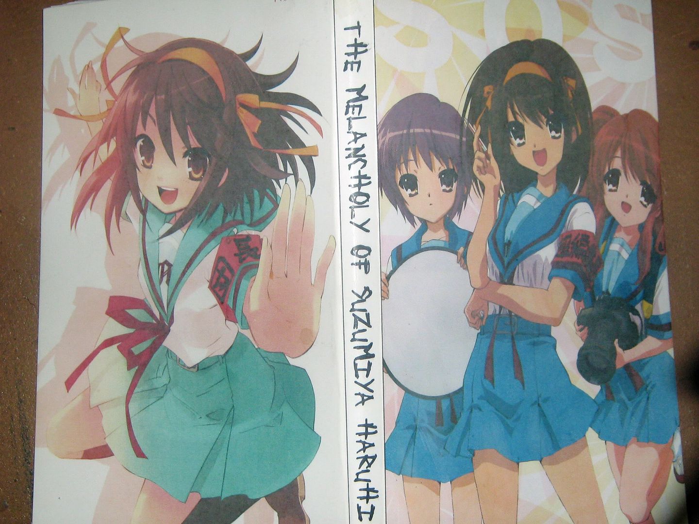
cool vector art cover (vol 1)
another cool vector art cover (vol 1)
original japanese cover (vol 2)
cool vector cover with title on spine (vol 2)
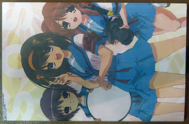
cool vector art cover (any vol)
You will notice that the japanese cover has three pages, while the vector only has one. This is for people whose printers cannot do custom sized borderless prints some (all?) Canons are like this, I know that some (all?/new?) HPs can do custom bordeless, Epson I have no idea. What this means is that if you cannot do custom borderles then you will have to do 8.5 x 11 borderless for the first page and then turn the page around and do another 8.5 x 11 borderless for the the second page, this will give one full size page. This is not possible with the other image, there is nowhere to split the image, and it won't print right if it gets cut through the actual image.
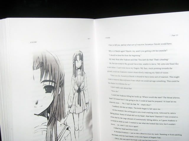
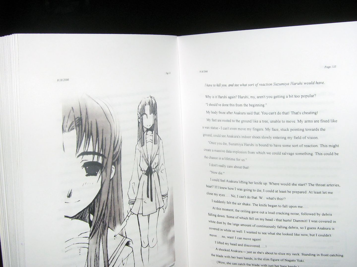
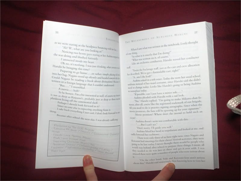
preview of the typesetting
Spoiler! :