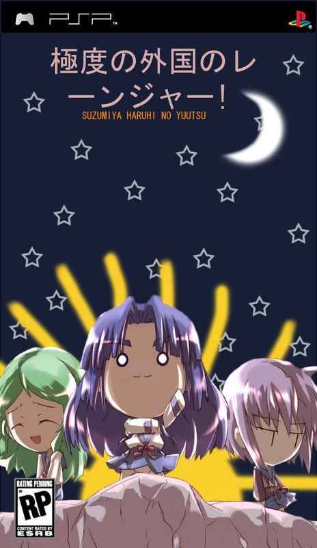
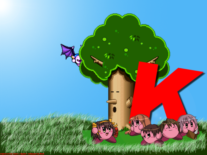
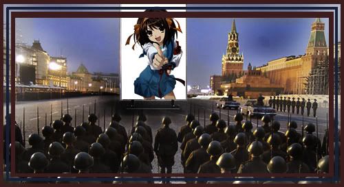
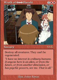
wow. you did some great pictures there, guest LOL.
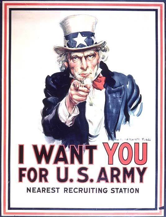
especially the recruitment one.
*saves it for an alternative wallpaper*
edit: oooh. i like that avatar too. cheers Guest.
edit2: hmmm...banner?...mm...
"Please note, we have added a consequence for failure.Any contact with the chamber floor will result in an unsatisfactory mark on your official test record, followed by death. Good luck."
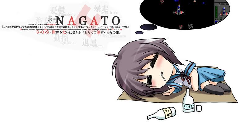
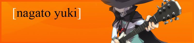
Seeing as how people like the Nagato Yuki background I made banner.
Something just doesn't feel right about this image though. Is it too plain? Is Yuki lacking legs? I just dont know what, but I feel that this isn't one of my better photoshopped images.... maybe it needs a border.
Added a border, shrank Yuki's size, still doesn't feel right..
Anybody want to evaluate and give me a suggestion, or some constructive criticism?
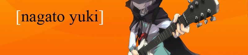
Guest lol, try putting in the Japanese text like in the wallpaper. It also looks like it's missing something to me, and I think that it's because there's too much empty space. Either that, or there's too much contrast between Yuki and the orange. Anyways, just a couple things my eyes don't find comfort in.
In the end I decided to scrap that crappy orange version altogether, I just dislike it.
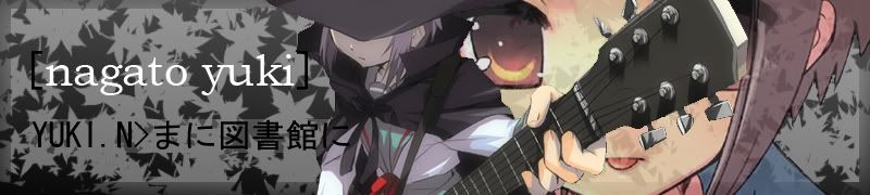
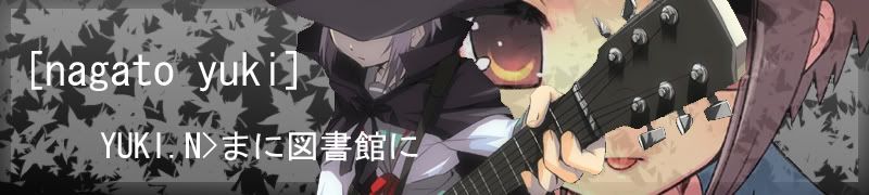
I followed the suggestions you guys posted and filled in the crappy black spaces with maple leaves... I wanted to have cherry blossem leaves, but I'm lazy, I might make a cherry blossem leave brush later when I feel like it... I also decided I would do what I did to fill the blanks in onizuka's banner, put in a big ass picture of yuki in the back lol.
Version 1
Version 2
Personally, I think version 1 is better because the text's colour isn't exactly the same.
Anybody want to criticize and say which one is better and why etc etc etc.
Very very nice. It's infinitely better than the orange one. I also prefer the first version, mostly because the bottom text is black and doesn't seem so invading, especially when it reaches Yuki.