Talk:Rakuin no Monshou:Volume3 Illustrations
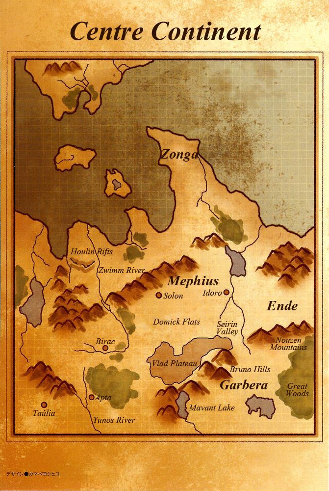
Map Names
I'll also add these to the project guidelines, but some comments beforehand:
大陸中央部 - Central Continent
ゾンガー: Zongha
- The elongated 'a' makes me want to (ゾンガ would be Zonga in my case and ゾンガー Zongaa, but this conflicts with the earlier アプター: Apta)
- I think it's a matter of accentuation of varying syllables that differs based on language. I read ゾンガ as accentuating the 'g' and ゾンガー as just a drawn out ending (Zonga/Zongah). I've translated it as Zonga where it's popped up in Volume 2.
ホーリン地溝: Houlin Rifts
ノーゼン山地: Nouzen Mountains
- Both have an elongated 'o' which is why I use 'ou' instead.
ズィム川: Zwimm River
- Quite sure about this one
ヴラド高地: Vlad Plateau
ブルーノ丘陵: Bruno Hills*
- Again an elongated 'u'; decided Bruno sounded nice enough.
タウーリア: Taúlia*
- I want to somehow indicate the Ta-u-li-a and not Tau-li-a
ユノス川: Yunos River
マヴァント湖: Mavant Lake
- Quite confident about these two too.
I haven't included the names already in Volume 1 up for discussion. I'm not sure if some names have already been decided upon in Vol2, I'll check that soon.--Dohma (talk) 09:03, 2 March 2014 (CST)
Curses! You're taking advantage of my fondness for maps... Oh well, I used photoshop this time, so it was easier. And people might actually want to look at the map while reading. I'll properly upload and replace the jp version after you tell me that you've finalized all the map names and approved the preliminary linked version. --Cthaeh (talk) 10:44, 3 March 2014 (CST)
- I put Zonga on the map right now. That's one of the names in question, but if that's what's chosen, I'll probably try to move it down a few clicks to a wider part of the peninsula so that its letters don't overlap the black lines so much. The other choices are longer, so if it's one of those it likely won't fit perfectly anywhere in the peninsula, and I'll probably just leave it in the original position. --Cthaeh (talk) 10:44, 3 March 2014 (CST)
Chances are you don't have a strong opinion, but I'll just mention that I used the same font as in the v1 color images text, Vijaya, which I picked pretty much at random after thinking it looked cooler than others (a slight slant, and maybe a few flourishes in some letters). The (v1) table of contents is different; there I used Times New Roman because it seemed to match the font that the original used for Mirage Kingdom. (As an aside, it looks like the illustrations don't include a toc for this volume?) --Cthaeh (talk) 10:44, 3 March 2014 (CST)